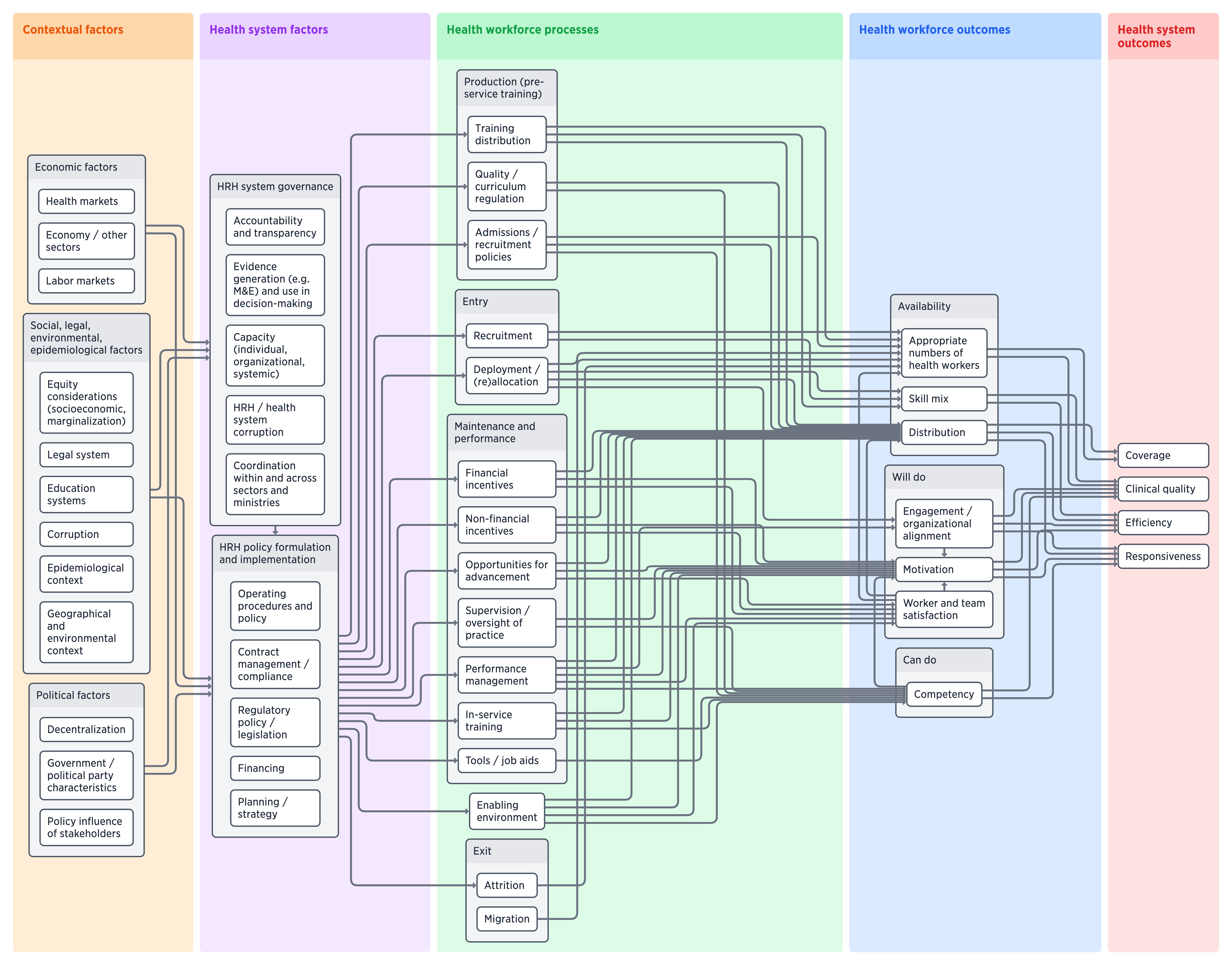
What is the HRH Visualizer?
The HRH Visualizer is an interactive logic model that shows how factors such as governance, policy decisions, and the country context affect a health workforce, and how a health workforce affects health system outcomes.
Using the visualizer, you can:
- Expand and collapse the model to show different levels of detail,
- Isolate parts of the model to show policy pathways or outcomes of interest,
- Click on boxes and arrows to see definitions, the available research, and common indicators.
Expand, collapse, and isolate pathways
Explore information on boxes and arrows
A work in progress
Our work on the HRH Visualizer has only just begun. We are continuing to build the tool, adding information to the boxes and arrows, and improving the tool itself. You can read about the background and initial development of the HRH Visualizer here.
If you have ideas for using or collaborating on the visualizer, we would be very happy to hear from you! Please contact Tim Roberton at timroberton@jhu.edu.
Expand the model to see detailed pathways
Potential applications
We see potential for this type of interactive tool to expand the traditional concept of a framework or logic model, creating possibilities for otherwise static images to become portals to explore data.
Evidence-to-policy processThe visualizer can support the evidence-to-policy process, presenting research in a visually appealing and accessible way, helping researchers to communicate with policymakers and practitioners.
Synthesizing the evidence baseThe visualizer can help to build consensus on existing and missing evidence on human resources for health, bridging the gap between evidence, policy, and practice.
Education and trainingThe visualizer can serve as an educational tool for students to understand policy pathways and explore the literature on human resources for health.